A buffer stock is a price stabilization scheme. To run a buffer stock, some entity sets a target price of a particular good, and then buys and/or sells the good in whatever quantity is needed to move the market price to the target. The scheme operator thereby absorbs fluctuations in supply and demand, channeling them into changes in the size of the operator’s inventory of the good — the “buffer stock” — rather than into changes in price.
Buffer stocks are a key concept for Modern Monetary Theory (MMT). In fact, so far as I know, using buffer stocks to organize a broader framing on macroeconomic policy is an original contribution of MMT that nobody else has put forward.
So it drives me nuts that the diagrams out there for explaining how buffer stocks work are so messy. Here’s one example:
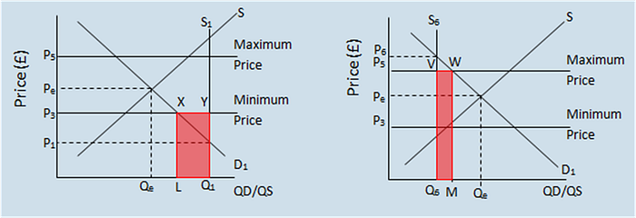
What I hope to do here is provide a simpler diagram for understanding buffer stocks. I’m not claiming revolutionary insights here — as we’ll see below, this diagram is based on the common depiction of how central banks set interest rates. But hopefully you’ll find it illuminating nonetheless.
Before we start though, a quick warning label: this diagram is a supply and demand diagram. I happen to believe that supply and demand diagrams, and the Perfect Competition model that lies behind most of them, are highly problematic ways to understand the economy and how prices are actually set. See here, here and here for some critique. This is especially true for some particular markets, eg. the labor market. In my view we must move beyond supply/demand in order to create satisfactory theories of distribution, inflation, etc. But that doesn’t mean that it isn’t a useful heuristic at times so long as the assumptions are made clear and a proper warning label is used, and this is one of those cases. So let’s see it.
The basic model
In a buffer stock, the buffer stock operator stabilizes the price of a good within a range, by choosing a “sell price” and a “buy price” that form the top and bottom of that range. We’ll start by assuming there’s some standard downward-sloping demand curve out there. Above the buy price we will leave it be, but if the market price hits the buy price, then the scheme operator will jump in to buy whatever is necessary to keep the price from falling lower. Since these purchases contribute to demand, that gives us a combined demand curve that looks like this:
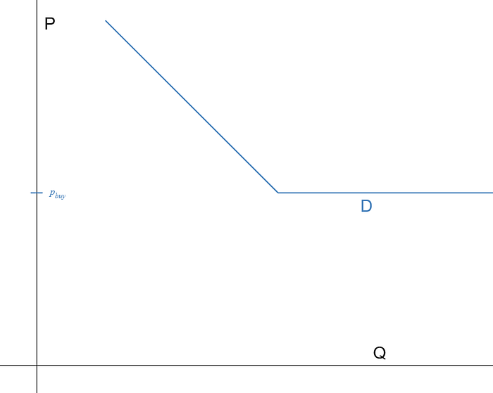
The downward sloping part comes from the market, representing the fact that the scheme operator does no buying if the market price is above its buy price, while the flat part is there because the buffer stock operator is willing to buy any quantity at the buy price.
Next we’ll allow for some standard upward-sloping market supply curve, with the buffer stock operator jumping in to sell to prevent the price from rising above the sell price:

The upward sloping part comes from the rest of the market and represents that the scheme operator does no selling when the price is below the sell price, while the flat part of the curve is because the buffer stock operator is willing to sell any amount of the commodity to prevent the price from rising above their sell price.
The result when you combine them shows your buffer stock stabilized market with an equilibrium price and quantity.
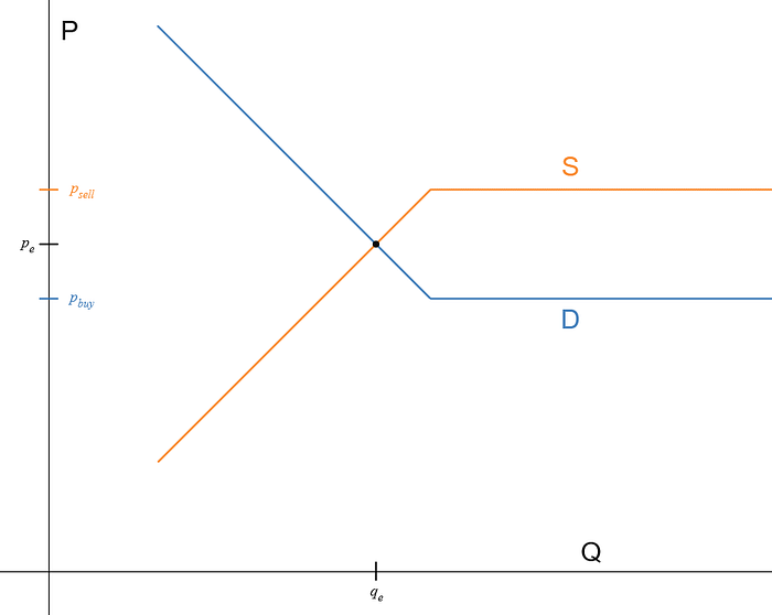
In figure 4 here, it just so happens that the unassisted “market forces” are keeping the price in between the buffer stock buy and sell prices anyway, so the scheme operator doesn’t actually have to do anything. But suppose that market demand falls a bit too much, i.e. the demand curve shifts to the left:

The equilibrium price has fallen but doesn’t fall below the buy price, because the scheme operator jumps in. Notice that the scheme operator is buying the residual between what other suppliers want to sell at the buy price and what buyers want to buy at that price. This is shown as the gap between q_d and q_e. Of course, the scheme operator can only pull this off until they run out of money (or credit) to buy with.
If market supply had increased rather than demand decreased, the picture would have looked the same. But what if market supply falls, represented as the supply curve shifting to the left?

The price rises but doesn’t rise past the sell price, because the scheme operator again jumps in, selling the residual between what the market is willing to supply at the sell price and what buyers want to buy at that price. This is shown as the gap between q_s and q_e. Of course, the scheme operator can only pull this off until they run out of inventory to sell.
Fiddling with prices
We could also ask questions about the relationship between the buy and sell prices. The gap between the buy and sell prices forms a ‘corridor,’ and the scheme operator can set this corridor as wide/narrow as they please, which would translate to looser/tighter control over the price. But what if they switched the prices, so that the buy price was higher than the sell price? Then things get dicey.
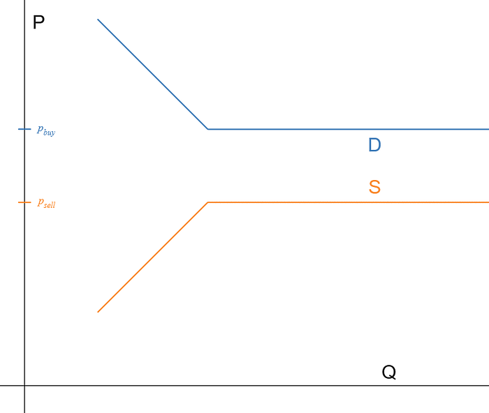
The curves don’t intersect, so we don’t have an equilibrium price or quantity…. what does this mean? Well, think about what other market participants might do if the buffer stock’s buy price is above the sell price: I can make a risk-less profit by simply buying a unit of the good from the stock (at its sell price) and then selling that unit right back to the stock (at its buy price)! So how much am I going to want to buy? Infinity! I’ll take every unit that the operator has, so I can sell them right back to the operator and pocket the difference between the buy and sell prices.
So, you can imagine that these two flat curves ‘intersect at infinity.’ Or, you might suppose that, because it takes inventories of money and the commodity to run this scheme, at some point off to the right the buffer stock runs out of one of these and the scheme becomes inoperable, so the curves stop being flat and resume their previous slopes, and therefore intersect.
Another interesting case: what if the buy and sell prices are set to the same price? Then, straightforwardly, the market price will exactly equal the buffer stock operator’s single price. This is shown in figure 8 (whose flux capacitor vibe is an unintentional side benefit).
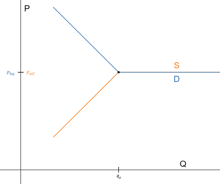
Figure 8 happens to show the special case that the market equilibrium price without the buffer stock transactions just so happens to equal the buffer stock price. In general this will not be true, as fluctuating market conditions prompt supply and demand curves to move, perhaps quite wildly. In general then we’d see cases that look more like figures 9 and 10. (See if you can work out for yourself what’s going on in these pictures.)


Further comments
So that’s the model. Before we go though I want to add some discussion that will paint a fuller picture.
What’s a commodity anyway?
Above I was writing as if the scheme is always to stabilize the price of some commodity like grain or corn on one side, against money being used to buy it on the other. But of course it doesn’t have to be this way. For one thing, the point might be more to stabilize the value of the money rather than the commodity — this is exactly how the gold standard worked, with the government buying and selling gold in order to lock the value of the currency to a particular amount of gold.
Or, we can imagine different items on each side: I guess hypothetically we could have barter markets with commodities on both sides…but more realistically, lots of real world buffer stocks have ‘money,’ or more generally financial assets, on both sides.
Consider a fixed exchange rate currency. To peg the local currency to a foreign currency, a central bank will run exactly the operations we’ve been discussing: buy your currency back (using foreign currency reserves) to keep its price from falling below the buy price, and sell your currency (buying foreign currency) to keep its price from rising above the sell price. As above though, the buy and sell price can form a corridor, or be set to the same price.
A case that actually fits the pattern of a “fixed-exchange rate currency” quite closely are bank deposits. The bank essentially runs a buffer stock to ensure that the value of their liabilities, the “deposits,” are always exactly equal to the value of state money. That’s why “$1” in your bank account is always exactly worth “$1” of paper money. The buy price and sell price are equal here, so we’d be using figures 8–10. (Note that the bank’s ability to do this depends on it not running out of paper money, which is why we have the Fed and the FDIC as government backstops to make sure they don’t.)
Whose operation is it anyway?
We’ve been tacitly assuming some sort of auction mechanism, which makes the idea of supply and demand curves, as well as a price that adjusts to equate supply and demand, a lot more plausible. However, it would really suck to be a buffer stock operator if you actually had to participate in an auction mechanism that forced you to specify a quantity rather than a price. That’s because without knowing exactly what the market supply and demand are, you don’t know what quantities would be needed to move the auction price to be within your corridor. You have to guess, and you’ll probably guess wrong. The result is that the price probably would not stay within the corridor at all times.
What you’d like to do instead is remove yourself from that auction, and just post prices. That is, instead of guessing quantities that the market needs, let the market come to you. Any trader who encounters a price outside the buffer stock corridor can just decline that trade and come to the buffer stock instead. In that case then, there’s really no reason for trades to ever happen outside of your corridor. (ALERT! The previous statement neglects all kinds of things like transaction costs, lack of liquidity, uncertainty, imperfect information, etc. But hopefully you get the idea.)
Central bank interest rate targets
If you follow monetary policy (skip this section if you don’t), then you’ve probably seen a graph that looks like figure 11, depicting how a central bank can use a “corridor system” to hit its interest rate target in the inter-bank lending market:

This graph is of course the inspiration for the ones I showed above, so I’m not claiming to have had a wildly new thought. But that said, there are a few important differences between this graph and mine. While the ‘price’ on the vertical axis is the interest rate on inter-bank loans, the horizontal axis doesn’t actually show the quantity of loans in that market. Instead it shows the amount of reserves that banks are willing to hold. Also, the market is decomposed in a different way: instead of showing borrowers and lenders separately, as you might if you drew the demand and supply of loans, the graph splits the world into the actions of commercial banks on the red line and the actions of the central bank on the blue line, so really the whole private market gets collapsed into the demand curve. (Coincidentally, I just read a recent explanation from Brian Albrecht about collapsing supply and demand curves into a single “total demand” curve, which is basically what’s going on here.)
The upshot then is that the flat parts of these curves happen for different reasons. The flat part of the supply (blue) curve in Figure 11 is similar as above, it’s because the buffer stock operator, the central bank, will add reserves in whatever quantity is needed to keep the interest rate within the corridor. But the the flat part of the demand (red) curve doesn’t just show the actions of the buffer stock operator but actually involves the rest of the market too: it indicates that no bank would want to lend out reserves at a lower interest rate than it could get for just holding them (which is the Interest On Reserves (IOR) rate that the central bank pays). So, at any interest rate below that, banks would do zero lending in the inter-bank market, which is equivalent to saying they’d hold all the reserves that exist, whatever that amount might be.
The Job Guarantee and other one-way buffer stocks
Besides using buffer stocks as a descriptive model to make sense of existing institutions like fixed exchange rates and interest rate targets, MMT also applies the concept analogically for understanding the neoliberal approach to fighting inflation. Briefly, that strategy has been to use policy (primarily interest rate adjustments) to keep unemployment above a certain level (called the NAIRU, or Non-Accelerating Inflation Rate of Unemployment), on the basis that high unemployment would make it hard for workers to bargain for higher wages, which would then keep costs and therefore prices down. Because this method relies on an adjusting pool of unemployed people to stabilize prices, MMTers refer to this strategy as an unemployment buffer stock.
But we believe there is a better way here, and that’s where MMTers go beyond using buffer stocks as descriptive, and start recommending that we add a major new buffer institution to the economy: a Job Guarantee (JG).
In a JG, the government would announce a fixed hourly wage, and then hire anybody who wants to work at this wage, to do small-scale local community service work. This is a buffer stock in labor, hence it also gets called an employment buffer stock (or labor standard, as a throwback to the gold standard). This too would stabilize the general price level by stabilizing wages —except it does so not by keeping wages down because people can’t find jobs, but by channeling changes in market conditions into changes in the number of people the government hires, i.e. allowing the “stock” to float, at a fixed price. Stabilizing the price of basic labor should then feed through to price stability overall, both by stabilizing costs (as various prices and wages are set at a mark-up over basic labor) as well as demand (as the total demand for labor is always kept exactly at the full employment level). So the JG is meant to anchor the value of the currency in general (hence “labor standard”).
You might notice though that this is only half of a buffer stock: the government only buys labor, it wouldn’t sell labor. So, shouldn’t that affect their ability to stabilize prices? The government could prevent the market price from falling below its buy price by buying the residual (as in figure 5 above), but how would they stop prices from rising if they can’t sell the residual (as in figure 6)? In other words, what would happen if the number of workers employed in the JG fell toward zero? Would inflation start spiraling upward, and how would the government deal with this?
The answer is that they would have to use other aggregate demand (AD) management policies to bring the overall demand for labor back down to a level where at least some people are employed in the JG. (The minimum number of people that likely need to be in the JG for it to function properly at preventing inflation is called the NAIBER, or Non-Accelerating Inflation Buffer Employment Ratio). For simplicity, think about taxes: they could raise taxes, which would reduce incomes and therefore reduce private purchases of goods and services, which would reduce private demand for labor, so some workers would leave their private jobs and take up JG employment. (Of course, there are other sorts of policies besides taxes that could reduce demand for labor, such as cutting government spending, increasing private saving, shifting around imports and exports, increasing productivity, etc.)
But however it happens, how would it translate on our graph? Before we do that, this is another place where a warning label is in order: supply and demand graphs are a TERRIBLE way to understand the labor market. Basically, just don’t do it! Again, I’m only doing it here to make a hand-wavey point that’s not really specific to labor markets. If you want to talk about some labor-specific issue, like the minimum wage, just do not do it!
But anyway, since the government does not sell labor, the supply curve has no horizontal part, and the market looks like this:

If either the demand for labor were to increase (shift right) or the supply of labor were to fall (shift left), then the government would use taxes or other AD management tools to shift the non-JG part of the demand curve to the left, so that there’s always a residual amount of labor for it to buy, keeping the market price at the buy price, which is the JG wage.
Conclusion
Buffer stocks aren’t just a niche piece of agricultural economics; they are a powerful tool for understanding macroeconomics. And if we’re going to place them so prominently in our explanation, we ought to have a clear, simple diagram that gives some intuition about how they work, so that’s what I’m offering here. While there are dangers of indiscriminately throwing supply & demand graphs around, this buffer stock model is still useful for wrapping your head about things like bank deposits, fixed exchange rates, and the Job Guarantee.